Kano Model: The Complete Guide for Product Teams
Understand the Kano model: 5 categories with real product examples, the Kano questionnaire and interpretation grid, and how to run a study step by step.
By the RoadmapHero team · Updated on · 7 min read
Key takeaways
- The Kano model, published in 1984 by Noriaki Kano, classifies features by how their implementation affects user satisfaction rather than treating satisfaction as one linear scale.
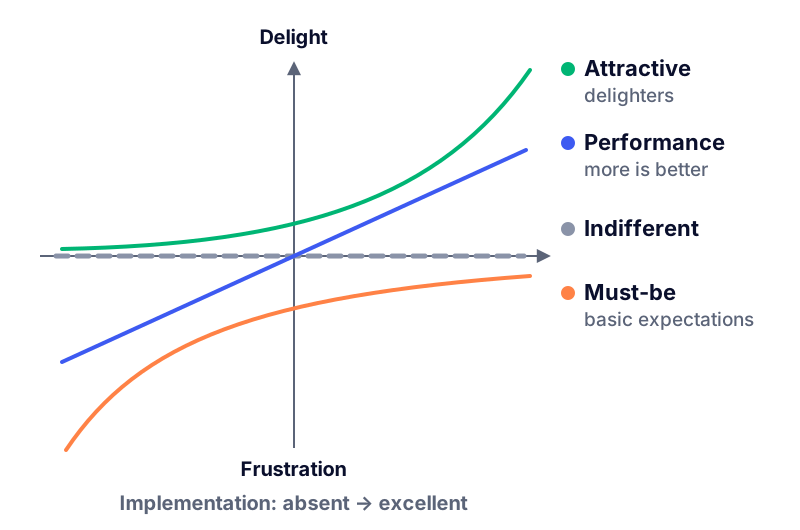
- Kano defines five categories: Must-be (basic expectations), Performance (more is better), Attractive (delighters), Indifferent (users do not care) and Reverse (users are annoyed).
- A Kano study asks a functional and a dysfunctional question per feature, maps each answer pair through an interpretation grid, and needs 15–30 respondents per segment.
- Kano categories erode over time, from Attractive to Performance to Must-be, so studies should be refreshed every 12–24 months and combined with a scoring framework.
The Kano model answers a question that scoring frameworks cannot: how will this feature actually make users feel? Not every feature creates satisfaction the same way. Some are silently expected and only noticed when missing; some pay off linearly; a few create disproportionate delight. Confusing these types leads to classic product failures — polishing delighters while a basic expectation is broken, or over-investing in features nobody cares about. This guide covers the five Kano categories with real product examples, the questionnaire and its interpretation grid, a step-by-step study protocol, and how to feed the results into your prioritization.
What is the Kano model?
Published in 1984 by Professor Noriaki Kano, the model breaks with the intuition that satisfaction is one linear scale ("more features = happier users"). Instead, it maps every feature on two independent dimensions: how well it is implemented (from absent to excellent) and the satisfaction it produces (from frustration to delight). Depending on the shape of the curve linking those two, a feature falls into one of five categories. The practical consequence is huge: investment decisions differ by category. You do not "improve" a Must-be the way you improve a Performance feature, and delighters follow completely different economics.
The 5 Kano categories, with product examples
1. Must-be (basic expectations)
Absent → strong dissatisfaction. Present → nothing; users take them for granted. Hotel guests never praise the room for having hot water, but its absence ruins the stay. Product examples: password reset, data not being lost, an e-commerce site accepting standard payment cards, brakes on a car. Strategy: meet the standard, then stop investing — perfection here buys no extra satisfaction.
2. Performance (linear, "more is better")
Satisfaction scales with how much you deliver. Battery life on a laptop, upload speed, storage quota, search result accuracy, fuel efficiency. These are the features customers consciously compare across competitors, and where pricing tiers usually live. Strategy: invest to be competitive on the dimensions your segment measures.
3. Attractive (excitement, delighters)
Absent → no complaint, because nobody expected them. Present → disproportionate delight. The first iPhone's pinch-to-zoom, Slack's playful loading messages, Notion's AI autofill when it first appeared. Strategy: a small number of well-chosen delighters differentiate more than ten average features — but they only work on top of solid basics.
4. Indifferent
Present or absent, users do not care. A large share of most backlogs quietly lives here — settings nobody changes, badges nobody reads. A Kano study's most immediate ROI is usually the list of planned features it reveals as Indifferent before they consume a quarter of engineering.
5. Reverse
Some users are actively annoyed by the feature's presence: autoplaying videos, aggressive gamification in a professional tool, an assistant that pops up uninvited. Reverse classifications often differ by segment — power users frequently rate simplifying wizards as Reverse while beginners love them.
The Kano questionnaire: functional and dysfunctional questions
Kano's method does not ask "do you want this feature?" — everyone says yes. It asks a pair of questions per feature:
Functional form: "If the app exported your roadmap to PDF, how would you feel?"
Dysfunctional form: "If the app did NOT export your roadmap to PDF, how would you feel?"
Both use the same five answer options: I like it / I expect it / I am neutral / I can tolerate it / I dislike it. The magic is in the combination: someone who is neutral about presence but dislikes absence is describing a Must-be; someone who likes presence and is neutral about absence is describing an Attractive. Keep feature descriptions concrete and benefit-level (what the user can do, not how it is built), and test at most 15–20 features per questionnaire to avoid fatigue.
The interpretation grid
Each respondent's pair of answers maps to a category through this grid (functional answer in rows, dysfunctional in columns):
Functional \ Dysfunctional | Like | Expect | Neutral | Tolerate | Dislike |
|---|---|---|---|---|---|
Like | Questionable | Attractive | Attractive | Attractive | Performance |
Expect | Reverse | Indifferent | Indifferent | Indifferent | Must-be |
Neutral | Reverse | Indifferent | Indifferent | Indifferent | Must-be |
Tolerate | Reverse | Indifferent | Indifferent | Indifferent | Must-be |
Dislike | Reverse | Reverse | Reverse | Reverse | Questionable |
"Questionable" flags contradictory answers (liking both presence and absence) — usually a misread question; discard them. Aggregate across respondents and assign each feature its most frequent category. When two categories are nearly tied, report both: a 45% Performance / 40% Attractive split is itself an insight about a market in transition.
Running a Kano study step by step
Pick 8–15 features to test. Candidate roadmap items, controversial requests, plus one or two features you ship already (as calibration anchors).
Write question pairs. Benefit-level, jargon-free, one capability per question. Pilot-test on two colleagues who are not PMs.
Recruit respondents by segment. 15–30 per segment. Your Customer Voice or feedback base is the natural pool — users who already gave feedback respond at much higher rates, as covered in our guide to customer feedback management.
Add an importance question (optional but recommended): "how important is this to you, 1–9?". It separates strong Must-bes from weak ones and breaks ties.
Field the survey. Keep it under 10 minutes; completion collapses beyond that.
Tabulate with the grid, per segment. Look for category splits between personas before averaging them away.
Debrief with qualitative follow-ups. Five short user interviews on the surprising results ("why is our flagship feature Indifferent?") are worth more than more survey volume.
Feed the roadmap. Translate categories into prioritization decisions (next section) and record the study date — results expire.
Expectation erosion: excitement becomes must-be
Kano's most strategic insight is that categories decay. Yesterday's delighter becomes today's differentiator and tomorrow's basic expectation. Smartphone cameras went from Attractive (2003) to Performance (megapixel wars) to Must-be (no phone ships without one). In SaaS: SSO, real-time collaboration and AI assistance are all sliding down that same curve right now. Two operational consequences:
Refresh studies every 12–24 months — a 2022 Kano result is archaeology.
Budget for erosion: your differentiators need a replacement pipeline, because they will stop differentiating. This is a core input to product strategy, not just to backlog ordering.
Using Kano results in prioritization
Kano is a research model, not a ranking formula — it knows nothing about effort or business value. The standard playbook for combining it with scoring:
Broken or missing Must-bes jump the queue: they are churn generators, whatever their score.
Performance features compete through your scoring framework (RICE, WSJF, HeroScore), with Kano data hardening the Impact estimate.
Attractive features get a protected slot — one per cycle, say — because pure value-per-effort math systematically underrates them (their Reach is unknowable before launch).
Indifferent features are cut, politely and with the data attached.
Reverse findings trigger design review: make it optional, segment it, or remove it.
Exploiting Kano insights in RoadmapHero
A Kano study is only useful if its conclusions survive contact with the backlog. In RoadmapHero, teams attach the Kano category to each ticket with a custom field, and let HeroScore do the arbitration: the configurable multi-criteria score weighs business value tied to OKRs, user value fed by Customer Voice (where the feedback that motivated the study already lives, linked feedback-to-feature), effort, risk and urgency. A broken Must-be shows up as high user-value pressure with high urgency; an Indifferent feature exposes its low user-value weight to anyone who asks why it was cut. The resulting roadmap is shareable in one click with unlimited viewers, so the "why" behind each priority stays visible. Free trial, transparent pricing in euros, no commitment.
Frequently asked questions
Who created the Kano model?
Professor Noriaki Kano, a Japanese quality management researcher, published the model in 1984. His key insight was that customer satisfaction is not a single linear scale: some features create satisfaction when present, others only create dissatisfaction when absent.
How many users do I need for a Kano study?
Aim for 15–30 respondents per segment as a practical minimum; below that, one odd answer distorts the categorization. If you serve distinct personas, analyze them separately — a feature can be a Must-be for admins and Indifferent for end users.
What is the difference between Must-be and Performance features?
Must-be features cause strong dissatisfaction when absent but no extra satisfaction when present (expected basics like password reset). Performance features scale roughly linearly: the more you provide — speed, storage, accuracy — the more satisfied users are, and the less, the more dissatisfied.
Can a feature change Kano category over time?
Yes, and it almost always drifts in one direction: Attractive features erode into Performance, then into Must-be as the market normalizes them. Free Wi-Fi in hotels and smartphone cameras both followed this path. That is why Kano studies should be refreshed every 12–24 months.
Is the Kano model a prioritization framework like RICE?
Not exactly. Kano classifies features by their effect on satisfaction, but says nothing about effort or business value. It is best used as a research input that feeds scoring frameworks: secure Must-bes first, invest in Performance competitively, and pick a few Attractive features to differentiate.