Leadership & strategy execution
Executive dashboard: what leadership really needs to see
How to build an executive dashboard leaders actually use: the metrics that matter, one-page design rules, live data over manual reports, and a weekly update.
By the RoadmapHero team · Updated on · 8 min read
Key takeaways
- An executive dashboard is a one-page view that answers four questions: are we on track, where are we stuck, what must we decide, and what changed since last time.
- Keep it to roughly 10 to 20 metrics across six categories (goals, financials, customers, portfolio, people, risks), each with a target, a trend, and a named owner.
- A good leadership dashboard reads in five minutes, shows trends rather than snapshots, and ends with an explicit list of decisions needed.
- Manually compiled reports are stale before the meeting: connect metrics to the teams' actual work and pair the dashboard with a short written weekly update.
An executive dashboard is a one-page view that tells the leadership team, in about five minutes, whether the company is on track, where execution is slipping, and which decisions are waiting on them. It does not replace functional dashboards; it pulls out only what affects the strategy. The best ones stay current without anyone assembling them, and come with a short written update every week.
Most leadership teams live the opposite reality: a 40-slide deck compiled on Friday by managers, outdated by Monday, skimmed at best, and a meeting whose first half hour goes to getting everyone up to speed. This guide lays out how to build a leadership dashboard that earns its place: what goes on it, how to design it, how to feed it, and how to run the meeting around it.
What is an executive dashboard?
An executive dashboard, sometimes called a leadership or strategic dashboard, is a management tool that brings together the key indicators of strategy execution: progress on company goals, financial health, customer health, project portfolio status, team capacity, and major risks. It exists to support decisions, not to inform.
It differs from neighboring tools in three ways:
An operational dashboard tracks a team's day-to-day activity (tickets closed, orders shipped, incidents). The executive dashboard tracks the company's trajectory, at a coarser grain and a slower pace.
A report describes what happened. A dashboard highlights gaps against targets and calls for action.
A project status dashboard serves a project lead and a steering committee. The executive view rolls up the whole portfolio and only drills into a single project when it threatens a company goal.
What do executives actually need to see?
Before picking metrics, start from the questions a leadership team asks every week. They are almost always the same:
Are we on track? Where each strategic goal stands against its target and timeline.
Where are we stuck? Which goals, projects, or teams are slipping, and why.
What do we need to decide? The trade-offs that cannot be made further down: budget, priorities, hiring, cross-department dependencies.
What changed since last time? Notable deliveries, customer signals, new risks.
Anything that answers none of these four questions does not belong on the first page. This filter is the most effective one you have: it immediately removes activity metrics (meetings held, tickets opened, raw leads) that feel reassuring but explain nothing.
If you run the company on OKRs, the first question is simply OKR tracking, and the dashboard becomes the weekly view of your company OKRs.
Which metrics belong on an executive dashboard?
Around 10 to 20 metrics is enough, grouped by category. Beyond that, the page turns into a catalog and attention scatters. Here is a starting point to adapt to your business model:
Category | Example metrics | Why it matters |
|---|---|---|
Strategic goals | OKR progress, confidence level | Shows whether the strategy is moving |
Financials | Revenue vs plan, gross margin, cash runway | Confirms the trajectory is sustainable |
Customers | Net revenue retention, churn, NPS, time to value | Flags value erosion early |
Project portfolio | Projects on track, at risk, late | Shows where execution is slipping |
People and capacity | Utilization, open key roles, attrition | Anticipates bottlenecks |
Risks and decisions | Top five risks, decisions pending | Puts trade-offs in front of leadership |
Two safeguards. First, every metric needs a target, a trend, and a named owner on the leadership team: a number without a target says nothing, and a number without an owner is defended by no one. Second, separate leading indicators (sales pipeline, new-customer activation, progress on key deliverables) from lagging ones (revenue, churn). Lagging indicators confirm; only leading indicators still leave time to act.
For the product side, our guide to product metrics and KPIs covers the ones worth tracking, and a North Star Metric can sum up the value you deliver in a single number.
One-page design principles
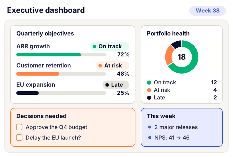
One page, readable in five minutes. If the dashboard needs a presentation to be understood, it is too dense.
Strategic at the top, detail at the bottom. Goals first, then portfolio health and key metrics, then decisions needed.
Trends, not snapshots. A single value tells you nothing; with its target and last three data points, it tells you where you are heading.
A written color rule. Green, amber, red, with an explicit definition, for example red if the gap to target exceeds 20% or a key milestone is missed. Without a rule, everyone picks their own color.
Exceptions first. What is on track takes one line; what is slipping gets an explanation and an action.
A "decisions needed" section. It is the most useful part and the one most often missing. Each decision has an owner and a deadline.
One version for everyone. The whole leadership team reads the same dashboard at the same time. Two versions of the same number are enough to derail a meeting.
From manual reporting to live data
Most companies go through four stages of maturity:
Slide-deck reporting. Each department sends its slides and someone consolidates them. It takes hours, arrives stale, and the numbers never match across departments.
A shared spreadsheet. One file, updated by hand by each owner. Better, but freshness depends on everyone's discipline.
A BI tool. Financial and sales data is automated, but progress on projects and goals, which lives in other tools, is often still typed in by hand.
A view connected to the actual work. Goals are linked to the teams' projects and deliverables, and progress updates when teams ship, straight from the tools they already use.
Stage four changes what the leadership meeting is for: everyone arrives having read the same thing, and the time goes to decisions instead of status updates. On the execution side, this is what RoadmapHero does: each goal shows progress calculated from what has shipped, work flows in from Jira, Linear, or GitHub, and the leadership view is shared as a link, with no account needed. Financial metrics stay in your finance and BI tools.
When the dashboard flags a problem, the trade-off itself belongs in project portfolio management: the dashboard signals, the portfolio process decides.
The written weekly update
A dashboard shows numbers; it does not explain why they move. A written weekly update fills that gap. Keep it to half a page, with the same structure every week:
The gist in three lines: what a leadership team member should remember if they read nothing else.
Goals: what moved, what is slipping, and why.
Shipped this week: the deliveries that move a goal, not the full list.
Risks: new ones, and those whose level changed.
Decisions requested: the question, the options, the recommendation, the deadline.
Send it at a fixed time, say Monday morning, and expect it to be read before the meeting. Writing forces clarity and removes the catch-up portion of the meeting. In RoadmapHero, this update can go out automatically every week, written from what actually shipped, tailored to each audience (leadership, sales, support), and reviewed by you before it is sent if you wish.
Running the leadership meeting around the dashboard
A dashboard is only as useful as the ritual that uses it. A format that works for a weekly 45-minute leadership meeting:
10 minutes on exceptions: only what is amber or red, presented by its owner.
25 minutes on decisions: the "decisions needed" list, handled in order of deadline.
10 minutes on actions: who does what before next week, recorded in the update.
Executive dashboard vs board reporting
Board reporting draws on the same data but serves a different reader. The board meets quarterly, needs more context and fewer operational details, and focuses on strategy, financials, and major risks. Build the board pack from the executive dashboard rather than as a separate system: if the two tell different stories, trust erodes quickly. For the quarterly roadmap review itself, our guide on how to present a roadmap to executives offers a five-slide structure.
Executive dashboard mistakes to avoid
Watch out for the "watermelon" dashboard: green on the outside, red on the inside. If everything is always green, it is not because all is well; it is because raising a red flag costs too much for the person who raises it. Publicly thank whoever flags a problem early.
Too many metrics. Past twenty or so, nobody knows what matters anymore.
Numbers without targets or owners. They describe; they do not steer.
Activity instead of outcomes. The number of projects launched says nothing about strategic progress.
A dashboard that changes every month. Keep metrics stable for at least a year so trends mean something.
No decision at the end. If leadership looks at the dashboard and decides nothing, it is just another report.
Start small: one page, three goals, a decisions section, and an update every Monday. To connect this view to the rest of your operating model, read our strategy execution guide, or try RoadmapHero with your own goals.
Frequently asked questions
What should be on an executive dashboard?
Roughly 10 to 20 metrics across six categories: progress on strategic goals, financials such as revenue, margin, and cash runway, customer health such as retention and churn, project portfolio status, team capacity, and major risks. Each metric needs a target, a trend over time, and a named owner on the leadership team, plus a short list of decisions needed.
What is the difference between an executive dashboard and a report?
A report describes what happened over a period, often exhaustively. An executive dashboard highlights gaps against goals and the decisions that need to be made. Reports inform, dashboards steer. Ideally, the dashboard is fed automatically from the systems where work happens instead of being compiled by hand before each meeting.
How often should a leadership dashboard be updated?
It should be current before every leadership meeting, which usually means weekly. Execution metrics, such as progress on goals and projects, are best updated continuously from the teams' own tools. Financial metrics typically follow a monthly close, and board reporting follows a quarterly rhythm built from the same underlying data.
What is the best tool for an executive dashboard?
A spreadsheet is fine to start and validate your metrics. A BI tool then automates financial and sales data. For progress on goals and projects, a tool connected to the teams' actual work removes manual updates. Whatever you choose, define the questions and metrics first, then pick the tool that serves them.
How is board reporting different from an executive dashboard?
Board reporting is quarterly, written for directors who are not involved in day-to-day operations, and focused on strategy, financial performance, and major risks. An executive dashboard is weekly and built for the people running the company. Both should draw on the same data so the board and the leadership team never see conflicting numbers.